Billboards, if you haven’t tried one, are expensive ($3,000-10,000 per month) and created by some of the biggest ad agencies on the planet. This means that hundreds of thousands of dollars are poured into them (just like Super Bowl commercials) to make them effective. As a small business marketer, these are giant marketing lessons just begging to be seen and we need to pay attention!
There are of course vast differences between billboards and postcard marketing: with postcards, you typically aren’t reading them while driving a car, so there’s no risk of crashing. And unlike billboards, you can get away with some fine-print because people can stop wherever they are to take a second glance. But, because postcards are so flexible, people often get lazy and crowd them with too much text and glaring images.
Because billboards are forced to be big, visible, bold, and immediately understandable, there’s a lot that we can learn to improve our direct mail marketing!
Here are 6 things that billboard ads can teach us for postcard marketing:
- Less text is more. The rule of thumb for billboard advertisers is 7 words or less. Seem crazy? It’s quite a challenge, and as writers often say, “If I had more time, I would have written a shorter ad,” because it takes a lot of thought and effort to boil everything that people need to know about your company into a single sentence. Try it out and you’ll find that what’s left with is all that really matters.
- Use readable fonts. Direct mail marketers often see the dropdown menu for alternative fonts and they presume that they should customize theirs. Don’t. Billboard advertisers stick to Arial, Calibri, Verdana, Tahoma, and Helvetica because they’re simple and can be seen from afar, especially when bolded.
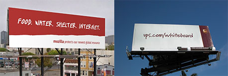
- Simple designs are elegant. What do 95% of billboards consist of? A flat background, text, and a small logo. That’s it. And rather than looking drab and empty, in this age of digital information overabundance, it gives them a clean and elegant aesthetic. Just think about Apple’s marketing, with white text on a gray background. Or look at any of these billboards for inspiration. Without the clutter, your message hits home harder.

- Repetition is the key to recognition. What do all of Chik Fil-A’s billboards have? Cows. Allstate’s? A guy named Mayhem. McDonalds’? A bright red background. What are they doing? Sticking to the theme! We remember things far better when we’re exposed to them over and over and you should adopt this in your postcard marketing. Find an image or a color that works well and use it repeatedly to drive home your message over multiple postcard sends!
- Consider 3-D effects. Some of the most attention-grabbing billboards mess with our sense of reality by incorporating 3-D effects. Can you use these in postcard marketing? Absolutely. One customer of ours who handles pet grooming has her postcards shipped to her and she cuts out a doggie bite from each one. Another one who does shipping puts an extreme-angle image of an eighteen-wheeler that looks like it’s jumping out of the postcard at you. What can you come up with?
- Use visual analogies. A picture is truly worth a thousand words and good billboards drive home their message at a single glance. Come up with some creative visual analogies for your business like “rock-solid insurance coverage” or “landscaping will have you in heaven.”

Put it all together and you have some killer tactics for tightening up your postcard marketing. If you can use less text, readable fonts, elegant designs, repeated images, 3-D effects, or visual analogies you’ll drastically increase your response rate and turn that marketing campaign into paying customers.
So what are you waiting for? Try out one of the visual analogies above by selecting stock photos in our web-to-print platform! If you’re drawing a blank and need inspiration, give one our customer marketing experts a call at 1 (877) 222-6010!
Need a billboard-sized campaign?
Opportunity Knocks is a sister company of ProspectsPLUS who can turn your ideas into full-fledged multi-stage marketing campaigns that dominate your market and set you up with serious recurring revenue. Give them a call to see what they can do for you right now at 1 (866) 319-7109!